1to1Help
Redesigning a Mental Wellness Platform so every user's journey feels personal
Redesigning a Mental Wellness Platform so every user's journey feels personal

Team
1 Lead Designer
2 UX Designers
Role
Design Research
Conceptualisation
Design
Client
1to1help
Duration
04 months
Overview
1to1help is an employee mental wellness platform that connects individuals to therapy, counselling, and self-help resources through their organisation, bridging the gap between recognising you need support and actually accessing it.
The project was a full redesign of their mobile and web platform. Mental wellness being a sensitive space, so the design had to balance between making users feel safe enough to open up, and confident enough to take action. Every decision was anchored in 1to1help's core values - confidentiality, empathy, and responsibility, ensuring the experience felt trustworthy at every step, not just visually, but in how it guided people through their journey.
The problem
Given the sensitive and evolving nature of mental well-being platforms, we began by understanding the landscape through secondary research and exploring the client’s objectives. Reviewing the existing app module-by-module was key to grasping their goals and reasons for a redesign. One key observation included the need for users to engage with the app 2-3 times a week, with current retention relying heavily on push notifications.
The app faced several usability issues that hindered user engagement and accessibility. A complicated registration flow made onboarding difficult, while users struggled to navigate and find the resources they needed. The booking experience was inefficient, leading to frustration, and a lack of clear progress tracking left users feeling uncertain about their mental well-being journey.


Project goals
Before this project, maintenance scheduling happened over email and spreadsheets. Customers managing hundreds of servers would tell support teams when they wanted maintenance — and at that scale,
Create a unified experience across all the mobile and the web platforms for
flexible use and easy access.
Make it more solution-focused by providing more actionable items
and outcomes.
Design a supportive, user-centred interface that offers guidance and
reassurance throughout the journey.
Build a comprehensive platform for high quality mental health resources
and assistance.
Behavior goals
✨
Increase user retention by making the app more engaging, delightful, and rewarding to use.
🚀
Make it more solution-focused by providing more actionable items and outcomes.
✏️
Cultivating a sense of empowerment and encouraging self-reflection.
Ideation
The ideation phase involved collaborative workshops to explore innovative solutions for mental well-being. Gamification emerged as a key approach to make routine activities engaging, while regular feedback sessions helped refine ideas to better meet user needs.

01
Personalisation
Enhance user engagement. Tailored content based on regular check-ins and assessments.
User progress for them to feel more in control of
their mental health journey.
Conversational language to make users feel comfortable about their emotional state.
02
Gamification
Ensure the user is motivated to use the app.
Engage users through fun & interactive
experiences.
Increase loyalty and user stickiness
03
Hand-held support
Seamless, hand-held experience for booking a
counsellor.
Friendly, conversational journey to make the
users know they aren’t alone.
SOS & Immediate help prioritising the user’s emotional state and their need for help.
Information Architecture
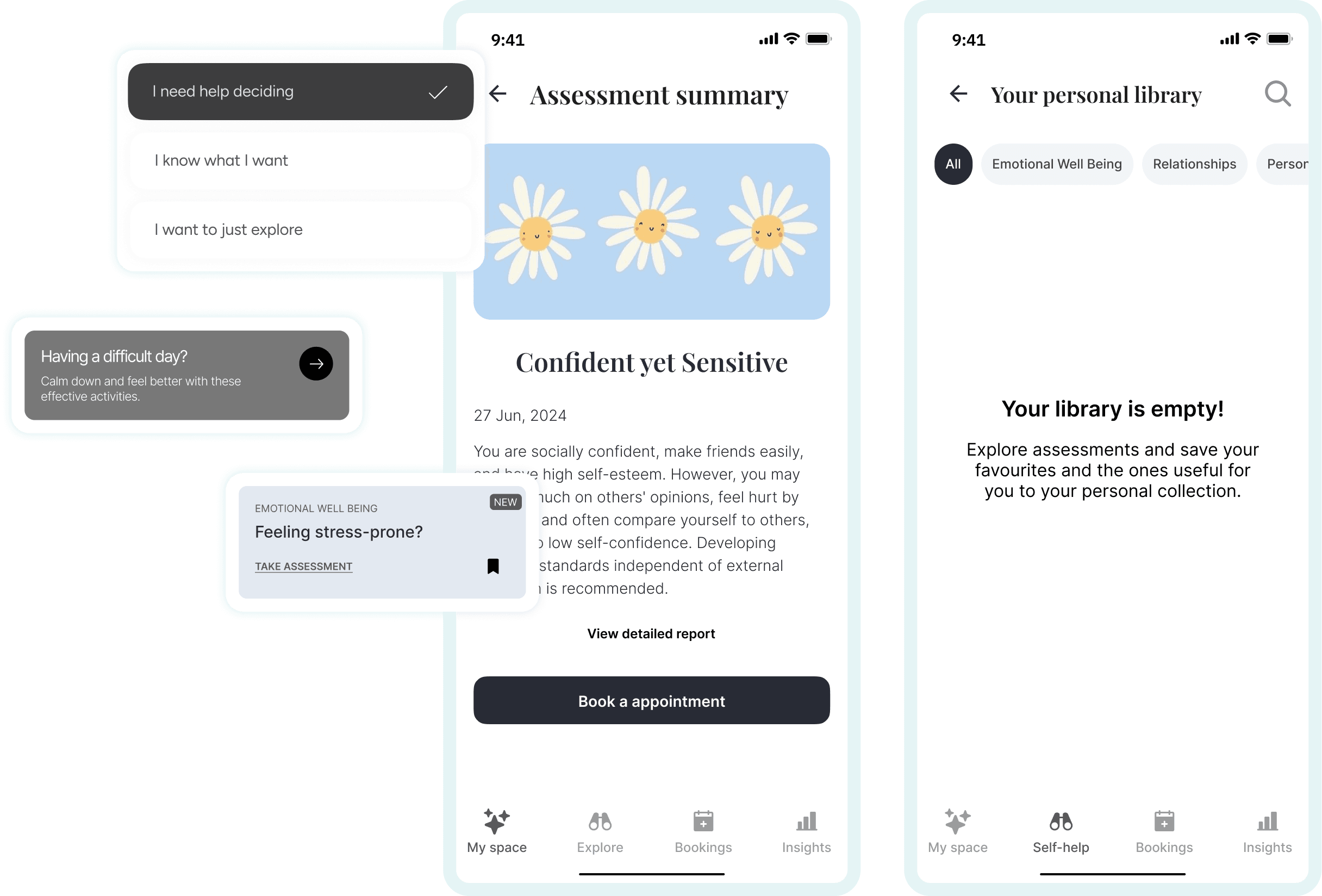
The IA helped in organizing ideas and creating a clear roadmap for the app. The bottom navigation was designed with four sections: Home (dashboard, recommendations and quick links), Self-help (featuring resources and assessments), Bookings (to schedule counselor appointments), and Insights (to track personal progress).

Tone of voice

The tone was kept inspiring to encourage users to engage in tasks and programs, while remaining empathetic to prevent feelings of demotivation.
Wireframes

Booking flow
Booking a session was a 6–7 step flow, selecting a category, answering stress-level questions, then choosing language, date, and time. Compliance
requirements meant these questions couldn't be removed, but the first two steps (category and stress-related questions) were emotionally
demanding for someone already struggling, and most users dropped off right there.
The fix: reorder the flow to start with date selection, the lowest-stress decision, and push the harder questions later. Starting light reduced the
emotional barrier at the exact point where users were most likely to leave.
Previous flow:

Redesigned flow:


Introducing the App

Personalisation
Enhance user engagement
Tailored content based on regular check-ins and assessments
User progress for them to feel more in control of their mental health journey
Conversational language to make users feel comfortable about their emotional state

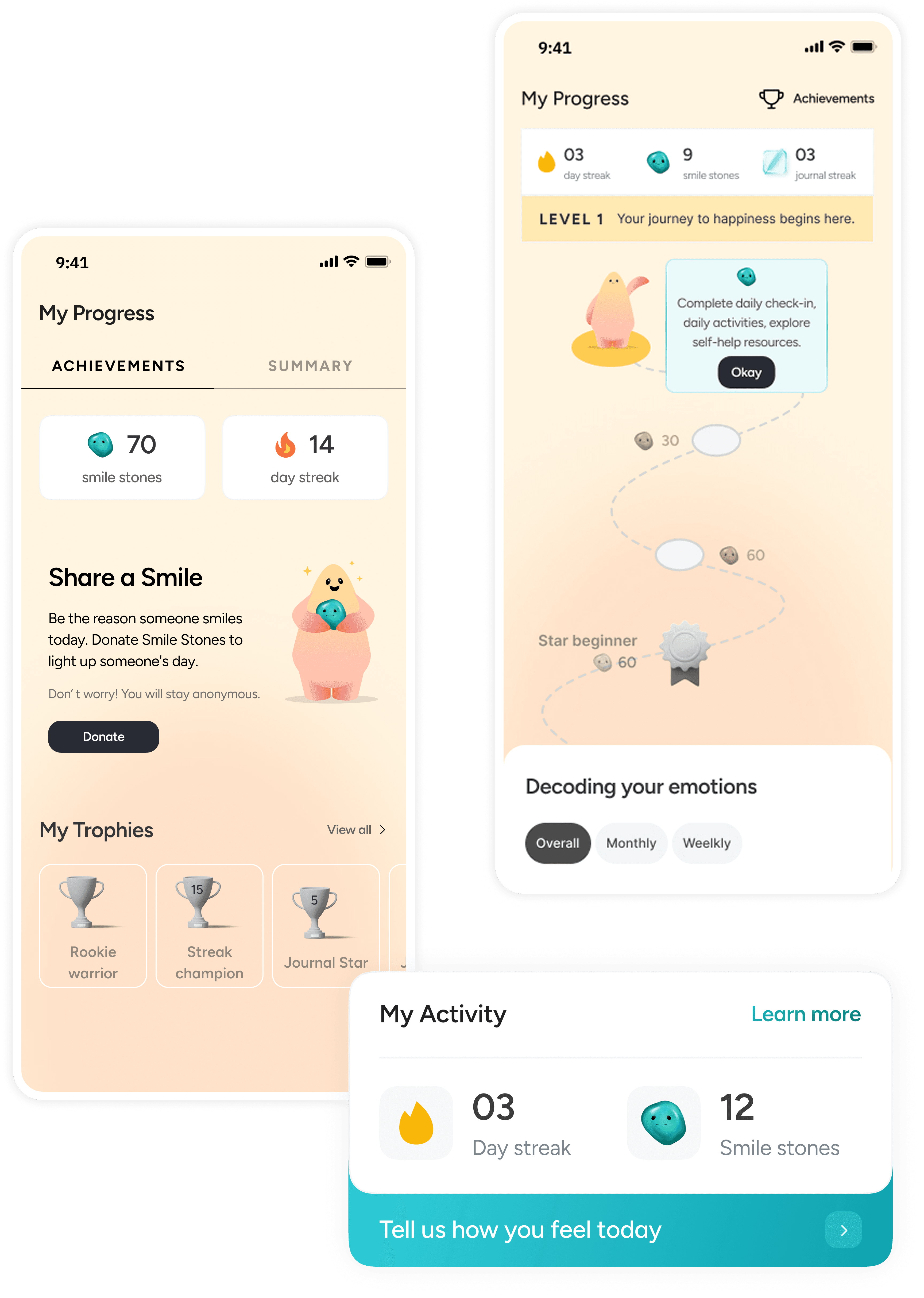
Gamification
Ensure the user is motivated to use the app
Engage users through fun & interactive experiences
Increase loyalty and user stickiness
Hand-held support
Seamless, hand-held experience for booking a counsellor.
Friendly, conversational journey to make the users know they aren’t alone.
SOS & Immediate help prioritising the user’s emotional state and their need for help.


Multiplatform experience
Mobile-first experience keeping in mind the need for confidentiality
Outcome & reflection
This project was a huge learning experience, not just in design but also on a personal level. It taught the importance of empathy and understanding that everyone is on their own journey, and respecting that. Since this was my first time exploring this domain, the design process which was taken was different suitable to this domain, which felt fascinating (with having doubts of its own). One big takeaway was realising how crucial communication is, not just what you say but the tone you use and the context. We struggled keeping the tone authoritative yet empathetic at first but learned a lot as we went on. It was also amazing to see how design thinking could make a positive impact in this space.
Overall, this project didn’t just help me grow as a designer but also helped me grow as a person.


Let's build something thoughtful!
Let's build something thoughtful!
Portfolio is just a glimpse - let’s connect for the full story
Portfolio is just a glimpse - let’s connect for the full story
Made with ♥️ . © Parth Kothari 2026
Made with ♥️ . © Parth Kothari 2026